")
Overriding Lightweight UI / Product Details Popup
NOTE: We are currently in the process of migrating to a new version of our platform (V3). To learn how to figure out which version you are on, click here. This article is on a feature that is currently only on the older version of our platform (V2) and will be made available soon for our V3 users.
Introduction
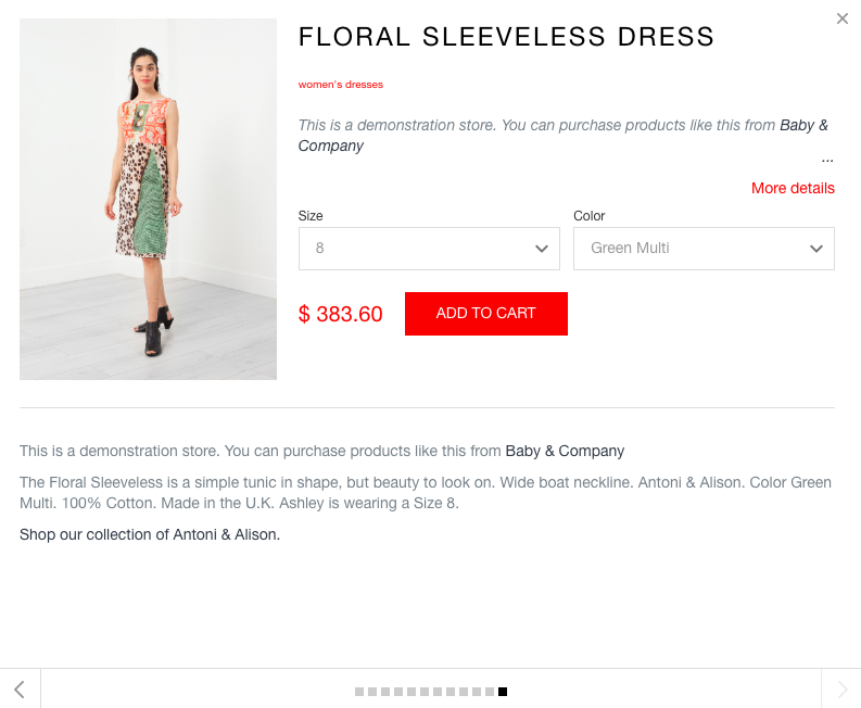
This post walks you through the steps required to create a custom product details popup using Swym APIs. By default, the product details popup looks as below –
Note: Overriding Swym UI components is a part of the Swym UI APIs which are currently in beta. This solution requires the Swym v2 JavaScript package. To try it out, please contact our support team using the chat icon on the right and they would be happy to provide you beta access to the APIs.
Step 1
Write the custom product details popup markup. Each Swym UI element is a JSX component. JSX offers a simple way to write UI elements with an HTML-like syntax. Following is the markup of the default LightweightUi JSX component –
LightweightUi.js
function LightweightUi(props, getHandler){
  return (
    props.productsDetailedLoading ?
    <span className="loading-msg">Loading</span>
    : (
      <div className="swym-product-view">
        <div className="clearfix">
          <LightweightUiTitle {...props} />
          <LightweightUiImage {...props} />
          <LightweightUiInfo {...props} />
        </div>
        <LightweightUiFullDesc {...props} />
      </div>
    )
  );
}
ShellCopy
Here, the complete component is composed of subcomponents, each of which takes care of a particular part of the product details UI.
For reference, we have included all the subcomponents that make up the Lightweight UI at the end of this document. Additionally, you will have access to the complete product data in the “props.product” object that you can use to surface in the product details popup UI. Click here to see the sample product data object.
In your markup for the custom product details popup UI, you can keep the components you like and replace the ones you don’t with your custom-built components.
Step 2
Wire required event handlers to your markup. Each Swym component receives all the event handlers available within the Swym context to respond to actions from the user. For example, assume that you wanted an add to wishlist button inside the product details popup or the ability to sign up for alerts on an out of stock product. With the Swym APIs, after writing the UI, you can simply use the addToWishlist handler. Here is a quick example –
function SampleComponent(props, getHandler){
  <a onClick={getHandler("addToWishList")(props.product)}>Add to Wishlist</a>
}
ShellCopy
Following are some common event handlers that you might need while creating your product details popup markup –
onVariantChange
If you are building a custom variant selector, call this handler in the onChange event of the variant selector.
Params –
event– the onChange event objectid– variant option label. For eg, if Size changed, the id will be “Size”product– the complete props.product object passed to the Lightweight UI component
buynowHandler
Event handler for add to cart event on the product details page.
Params –
eventObject– The Swym event object for this product. This is available as – props.product.eventProductproduct– the complete props.product object passed to the Lightweight UI componentevent– the click event objectdoRedirect– boolean true/false for whether or not should the user be redirected to cart page.
viewCartHandler
Takes the user to the cart page.
Params –
eventObject– The Swym event object for this product. This is available as –props.product.eventProductevent– the click event object
goToPreviousSlide
Takes the user to the last product details slide.
goToNextSlide
Takes the user to the next product details slide.
Step 3
Once the markup is written, we need to compile down JSX into JavaScript that the browser can understand. To perform this step, here are the substeps involved –
Go to this link – https://swymjsxcompiler.glitch.me/
Put in your JSX markup for the component and hit Submit.
Please copy the contents of the output received and take them to the Shopify theme editor.
Putting it all together
All calls to the Swym APIs need to be wrapped in a SwymCallbacks construct like shown below because Swym loads asynchronously after the site content has loaded.
// your compiled JSX product details popup function code taken from step 3
function CustomProductDetailsPopup(props, getHandler){
}

function swymCallbackFn(){
  SwymUiCore.registerComponent("LightweightUi", CustomProductDetailsPopup);     // overrides the default product details popup with your custom product details component
}

if(!window.SwymCallbacks){
 window.SwymCallbacks = [];
}
window.SwymCallbacks.push(swymCallbackFn);
ShellCopy
The swymCallbackFn gets called once Swym has loaded. Inside that function, we are calling the registerComponent API that overrides the default product image component with your custom component and then we are registering our new event handler that responds to clicks on the “listen to record” button.
That should do it! Refresh your site, add a product to wishlist, click on the product tile and celebrate!
Overriding only a part of the UI
Let’s say you only want to override a part of the product details popup. The workflow is as follows –
Step 1 : Pinpoint the components that you need to override from the components reference. Let’s assume you have to override LightweightUiBuyBtn .
Step 2 : Write the custom product details popup markup. Each Swym UI element is a JSX component. JSX offers a simple way to write UI elements with an HTML-like syntax. Please see the components reference to see some examples.
Step 3 : Once the markup is written, we need to compile down JSX into JavaScript that the browser can understand. To perform this step, here are the substeps involved –
- Go to this link – https://swymjsxcompiler.glitch.me/
- Put in your JSX markup for the component and hit Submit.
- Please copy the contents of the output received and take them to the Shopify theme editor.
// your compiled JSX product details popup function code taken from step 2
function LightweightUiBuyBtn(props, getHandler){
   // your code goes here
}
function swymCallbackFn(){
  SwymUiCore.registerComponent("LightweightUiBuyBtn", LightweightUiBuyBtn);     // overrides the default product details popup with your custom product details component
}

if(!window.SwymCallbacks){
 window.SwymCallbacks = [];
}
window.SwymCallbacks.push(swymCallbackFn);
ShellCopy
That’s it! You should start seeing your custom component instead of the default.