")
Best Practices to Optimize the ‘Notify Me’ Button
The “Notify Me” button or form, also known as the “Email Me When Available” button or “SMS When Available” button, is an essential element on your e-commerce site, especially if you have stockouts. It lets you capitalize on interest in out-of-stock products and keeps shoppers engaged until your inventory is restocked. In this article, we’ll explore how to get the most out of this button by optimizing its design and placement.
What is the ‘Notify Me’ Button?
When shoppers find an item they love but it is out of stock, they need a way to stay informed when the product is restocked. The “Notify Me” button is the answer.
Clicking this button lets shoppers subscribe for alerts via the Swym Back in Stock Alerts app. When your store’s inventory is replenished, customers who signed up will receive a message encouraging them to come back and make a purchase.
What Makes the ‘Notify Me’ Button Effective?
The “Notify Me” button is the first step to unlocking the many benefits of using the Back in Stock Alerts app on your e-commerce site. But first, shoppers need to use it.
This means your “Notify Me” button should be designed with your users (and their shopping experience) in mind. Here are a few key tips to remember:
- Keep your button easily visible. If shoppers don’t know where to sign up for alerts, they never will. So use bright colors and bold fonts to make your “Notify Me” button pop. You also need to place it where they will easily notice it when trying to buy the product.
- Make your button engaging. Capturing customer info helps you capitalize on interest in your out-of-stock products. To get shoppers to subscribe for alerts, your button should have an engaging call-to-action (CTA).
- Give the right info. Shoppers need to know what to expect when subscribing. Make it clear they’ll receive a notification via the contact method they’ve provided when your inventory is restocked.
Four Ways to Optimize the ‘Notify Me’ Button on Your Store
With these principles in mind, your “Notify Me” button should be treated as an important part of your out-of-stock product and category pages. But not all buttons and forms are created equally. Use these four best practices and examples to level up your “Notify Me” button and encourage shoppers to use it.
Choosing a Form or Button
When designing your site, you can add the “Notify Me” prompt as a button or form. The right choice for your brand depends on your site’s design and your audience.
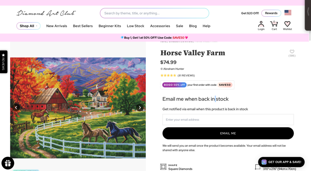
The inline form is embedded into your product page and lets the user add their email and subscribe right away. This is best if your page has few CTAs or caters to an elderly audience. Diamond Art Club uses an inline form on its clean, modern product pages.
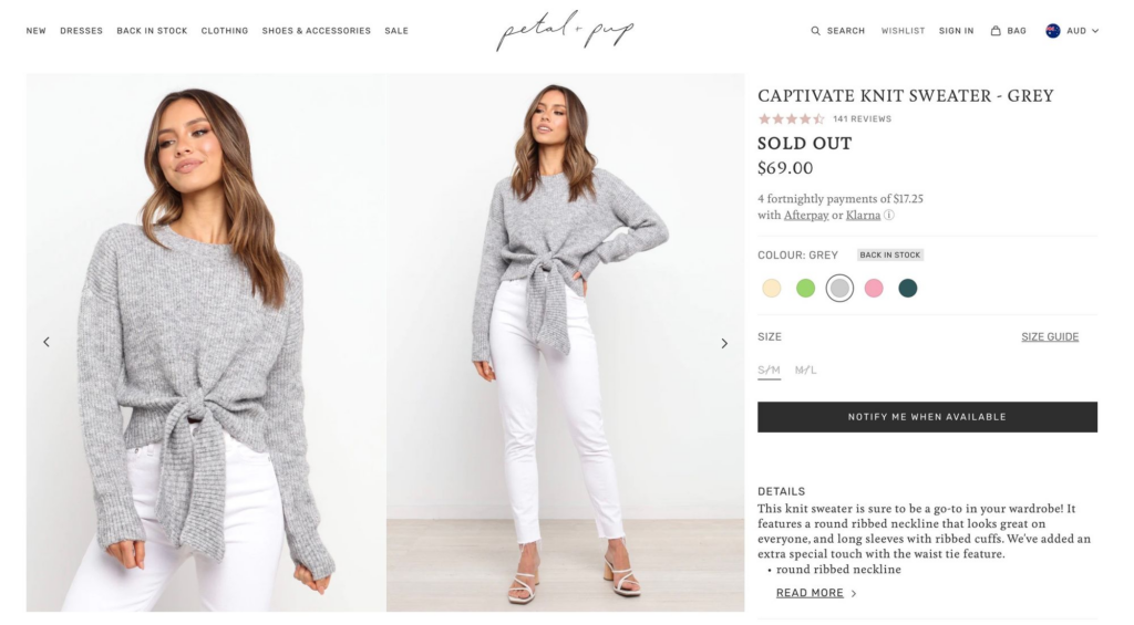
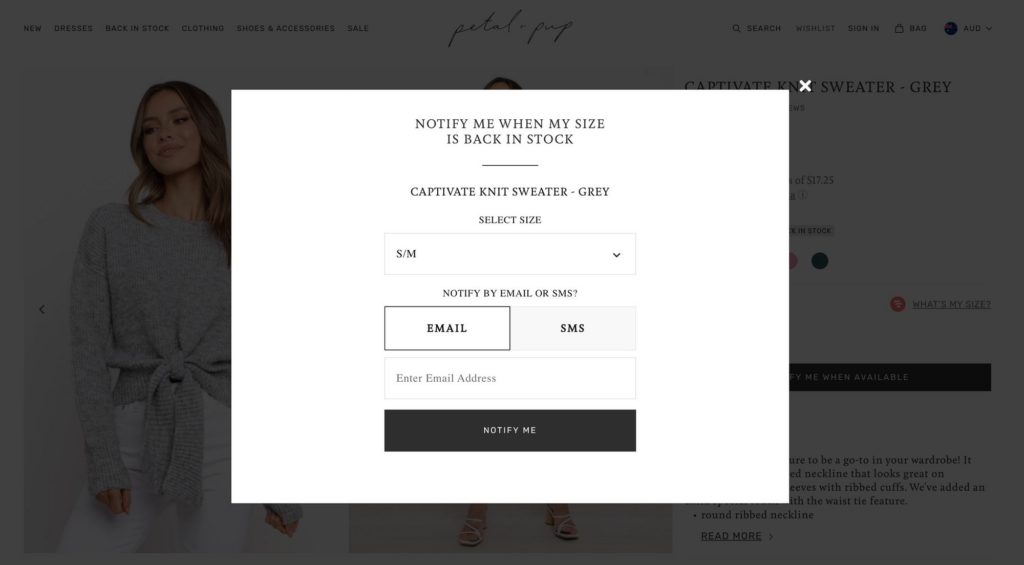
You can also choose a button that launches a pop-up form. This works best if your page is more detailed or has multiple CTAs. Petal + Pup uses the button approach since its pages have more information on them.
See this help document for more advice on choosing the right type of button or form.
Ideal Placement
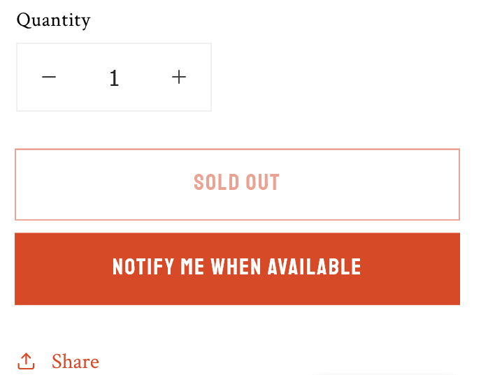
Your “Notify Me” button is placed below the “Sold Out” text on the product page by default. However, you can move it using HTML code to better fit the design of your site.
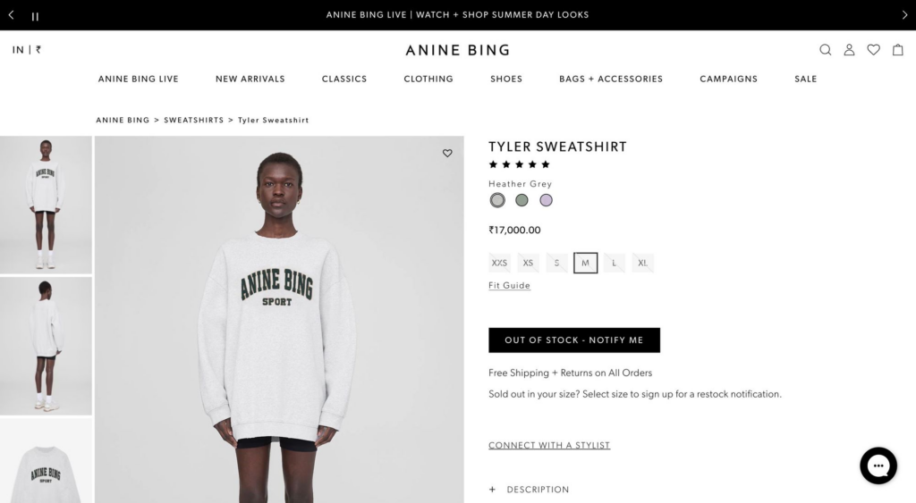
For example, Anine Bing combines the “Out of stock” text with its “Notify Me” button to create a cohesive CTA.
To learn more about custom placement for your button, please reference this help document.
Pick the Right Colors
When an item is out of stock, your “Notify Me” button should be the primary CTA. This means you should use bright or bold colors to make it stand out. If you’re using an inline form, you can use a border or background to attract the user’s eye.
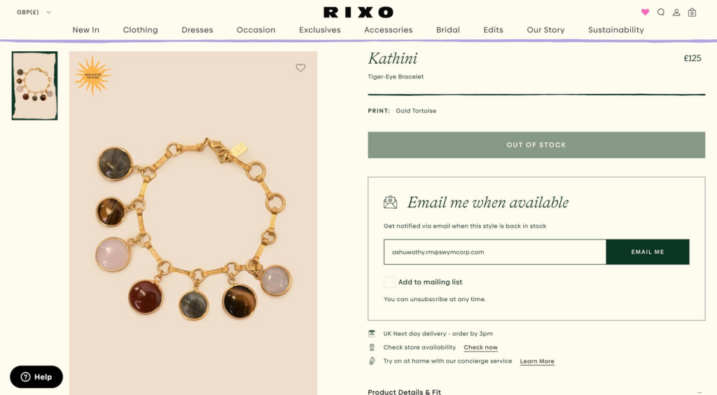
Rixo uses a border and icon around its form, which is also quite large so customers won’t miss it.
This generic example uses bright orange coloring to make its button pop on a white background.
Engaging Text
Lastly, ensure your “Notify Me” button engages the user. Key words like “Notify” “Alert” and “Sign up” tell shoppers exactly what to expect. Personalizing the button with “me” makes signing up more approachable.
Petal + Pup takes this a step further by adding “when my size is back in stock” to make signing up even more personal.
Following these best practices will help you get the most out of the Back in Stock Alerts app. If you need help optimizing your “Notify Me” button or form, we’re here to help. Just send us a message at support@swymcorp.com to get started.